Conversion & SaaS Growth

Dixie

Your onboarding flow isn't broken. It's a polite fiction. You spent weeks writing tooltip copy, sequencing your empty-state screens, and A/B testing your welcome email subject lines and your Day 0 churn hasn't moved. Here's the uncomfortable truth: your users aren't reading any of it.
They signed up with intent, landed in your dashboard, and made a subconscious ROI calculation in under 11 seconds. When the math didn't add up when the value wasn't immediately visible, they left. Quietly. Forever. That's the Activation Gap, and in April 2026, it's the #1 silent killer of MRR for PLG-first SaaS companies.
Key stats driving the Activation Gap:
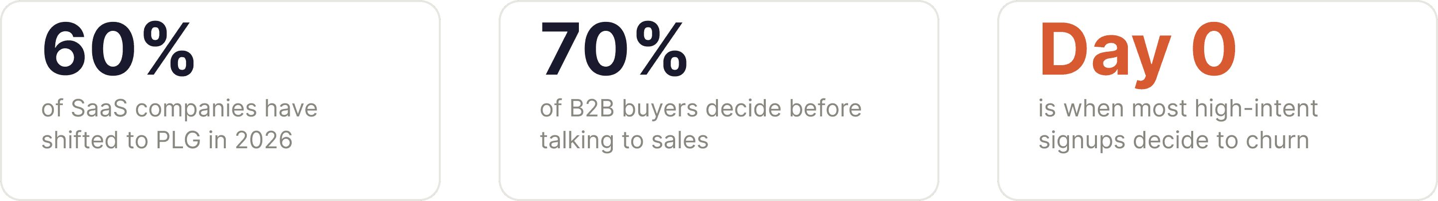
60% of SaaS companies now run Product-Led Growth as their primary motion
70% of B2B buyers complete their journey before ever talking to sales
Day 0 is when most high-intent signups make the decision to churn
The shift to PLG was supposed to fix this. Remove the friction. Let the product sell itself. But here's what nobody told you: PLG doesn't remove the need to tell a value story—it accelerates the deadline for telling it. When there's no sales rep to bridge the gap, your UI is your pitch. And right now, your UI is pitching silence.
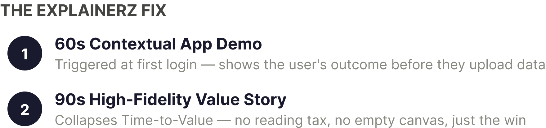
The Explainerz Fix: A 60-second Contextual App Demo, triggered the moment a user lands in your dashboard, replaces the gap where a sales rep used to stand. It doesn't tour the product. It shows the user's own outcome, visualized in your UI before they've touched a single setting. That's not onboarding. That's the Aha! Moment, delivered on demand.
The Activation Debt Nobody Is Talking About
Activation Debt accumulates every time a user signs up, fails to reach your product's core value, and churns before your success team even knows they existed. Unlike technical debt, it doesn't show up on a sprint board. It shows up in your cohort retention curves as a brutal drop-off at the 24-hour mark that your team has learned to explain away as "expected churn."
It isn't expected. It's preventable.
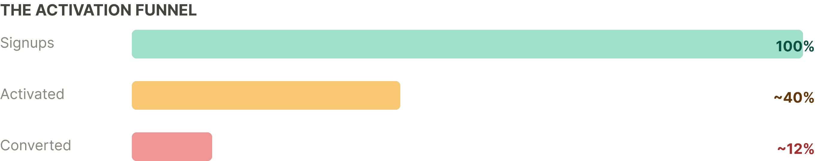
The gap between "Signed Up" and "Activated" is where your CAC goes to die. And the cruel irony is that the users abandoning your dashboard aren't low-intent tire-kickers. They're Product Qualified Leads people who found you through intent-driven search, read three comparison articles, and chose your free trial specifically. They had the highest purchase probability in your entire funnel, and you lost them to a blank canvas and a "Get Started" button.
"By April 2026, if a user has to talk to your sales team to understand your value, they've already signed up for your competitor."
The data is not subtle. B2B buyers now complete 70% of their evaluation journey before they'll speak to a human. That means your product's first impression isn't a discovery call it's a dashboard login. And most dashboards are built for retention, not revelation. They're designed for a user who already knows the value. They're catastrophic for a user who's still deciding whether to believe it.
The Explainerz Fix: Static product tours walk users through features. A high-fidelity 90-second Value Story shows users their end state what their data looks like inside your product, what the output feels like, what the win looks like. The animation does the cognitive work your empty dashboard can't. It collapses Time-to-Value from days to under 90 seconds.
Why Your Text-Heavy Onboarding Is Actively Costing You MRR
The average SaaS onboarding flow contains 11 steps, 4 tooltips, 2 empty-state prompts, and a welcome email sequence that starts 30 minutes after signup. It is designed by a product team that knows the product deeply, for a user who doesn't know it at all. The result is an experience that feels logical to build and completely alien to navigate.
Here's what the user actually does: They skip the tooltip. They ignore the empty state. They look at the dashboard, see complexity without context, and open a new tab. Your welcome email lands in their inbox 30 minutes later—by which point they've already started a trial at a competing tool that showed them a 45-second demo video on its homepage.
Every line of onboarding copy you've written assumes the user will read it. They won't. Not because they're lazy—because reading instructions is a tax, and nobody signs up to pay taxes. They signed up to get a result. The moment your product asks them to do work before they see value, you've broken the fundamental promise of PLG.
The Explainerz Fix: Stylized UI animation removes the reading tax entirely. Instead of asking a user to imagine what your product does with their data, you show them using a pre-built simulation of their likely workflow. The friction disappears because comprehension is instant. There's nothing to read. There's no empty canvas. There's only the outcome, playing out in front of them in 60 seconds.
The "Book a Demo" Button Is a Conversion Leak
Many founders treat the "Book a Demo" CTA as a safety net a way to capture the users who didn't self-convert. In 2026's PLG landscape, it's closer to a concession of defeat. If a high-intent user hits your "Book a Demo" button, one of two things happened: either your product didn't communicate its value clearly enough in the trial, or your value proposition is genuinely too complex to self-serve. The first is a fixable content problem. The second is a product problem.
For the overwhelming majority of B2B SaaS, it's the first. The value is there. The product delivers. But the story of the value never got told at the moment of highest intent the first login. So the user bounces, the PQL dies, and someone schedules a retrospective to discuss "top-of-funnel quality."
The top of the funnel is fine. The problem is a 24-hour window where your highest-value prospects are handed an empty dashboard and expected to reverse-engineer the value proposition you spent six months developing. Nobody should be surprised that they don't.
The Explainerz Fix: The In-App Bridge Video isn't placed on your homepage or in a drip email. It's triggered contextually at the exact moment of friction, inside the product, when a new user's behavior signals they're about to disengage. It's the closest thing to a sales rep whispering "let me show you what this looks like when it's working" at precisely the right second. That's not a feature demo. That's a conversion mechanism.
The ROI Math Is Not Complicated
If your activation rate moves from 22% to 38%, a shift well within reach for PLG companies that deploy contextual video at Day 0- the downstream effect on MRR is not incremental. It's compounding. More activated users means more users who hit the paywall having already experienced the value. It means higher conversion rates from free to paid. It means shorter sales cycles for the enterprise deals that still require human touchpoints, because the buyer arrives pre-convinced.
The Activation Gap isn't a UX problem. It's not a copy problem. It's a value delivery timing problem. The value exists. Your product works. The question is whether a brand-new user can experience that value within 24 hours, without help, in a way that feels inevitable rather than laborious.
Animated, contextual, outcome-first video is the only medium that delivers value comprehension at the speed PLG demands. Text requires effort. Static screenshots require imagination. A 90-second high-fidelity value story requires nothing except 90 seconds.
That's the gap. That's the fix. The only question is how many more PQLs you can afford to lose before you close it.
Explainerz builds 60-second contextual app demos that deploy at the exact moment of first-session friction, turning Day 0 churn into Day 0 activation. Visit Explainerz.com to learn more.


