Video Marketing
Explainer Videos
Conversion & SaaS Growth
Last updated: November 2026
Diksha Sharma
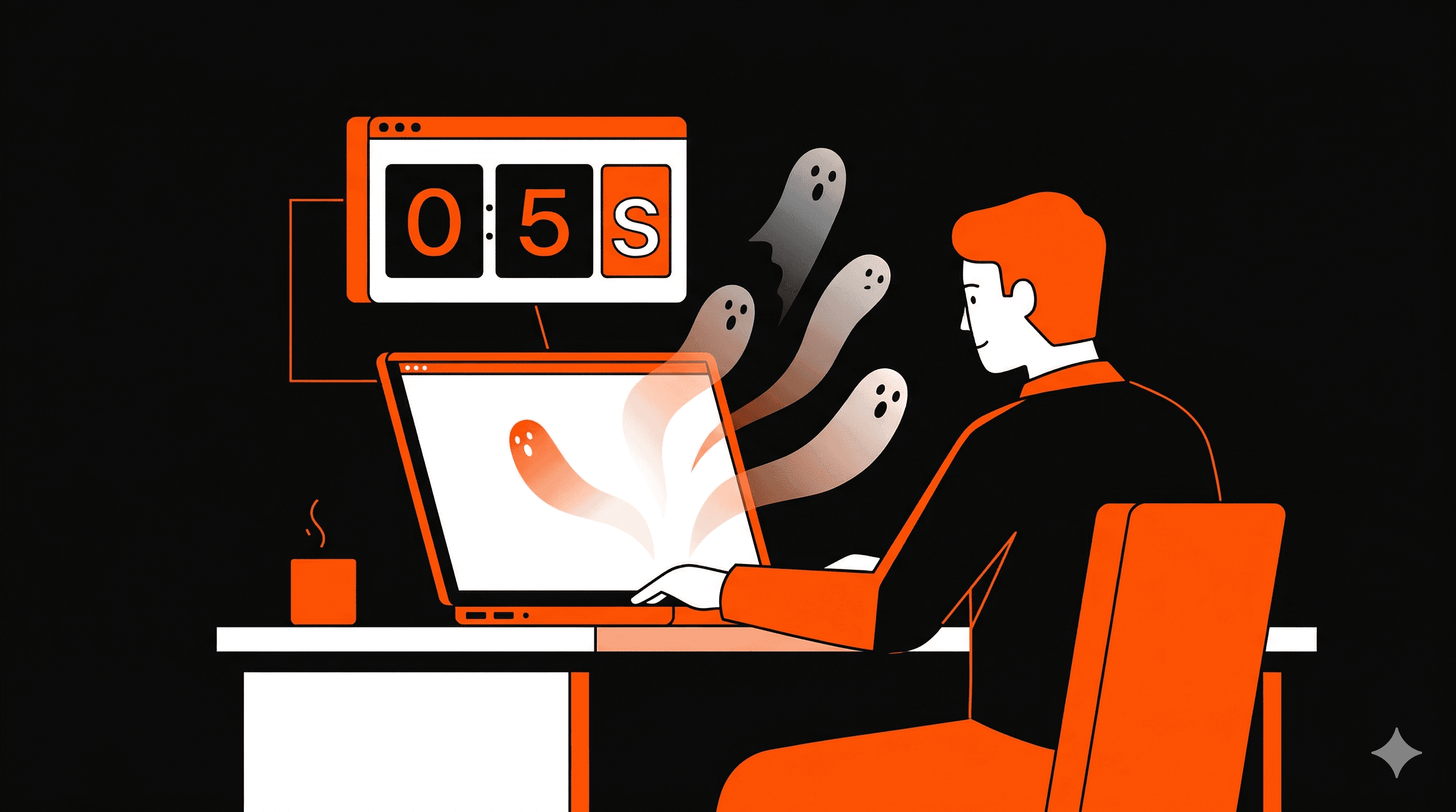

You spent $10,000 on paid ads this quarter. Your CTR looks solid. Traffic is up. And yet — your MRR barely moved.
Here's the uncomfortable truth: the bottleneck isn't your ads. It's your homepage.
Visitors decide whether to stay in seconds, not minutes. And if your above-the-fold copy is loaded with "enterprise-grade," "end-to-end," or "AI-powered workflow automation" — you've already lost them. They didn't bounce because they weren't interested. They bounced because they had no idea what you actually do.
That gap between your traffic and your conversions? It has a name: the Confusion Tax. And every day your homepage stays the same, you're paying it.
Short answer: Most SaaS websites don't have a traffic problem; they have a clarity problem. Visitors can't tell what the product does and who it's for fast enough, so they leave. A 60–90 second explainer video in the hero section shows the problem, the fix and the outcome before anyone has to read, so the right visitors understand you and take the next step.
What is the "Boredom Bounce" costing SaaS founders?
Every new visitor is silently asking one question: "What is this, and why should I care?" Most SaaS pages answer it with:
Long paragraphs explaining features
Generic headlines like "All-in-one solution"
Static screenshots with no context
No clear product story
The result is confusion, then drop-off, then lost leads.
Most founders assume more traffic solves a conversion problem. It doesn't. It amplifies it. Every new visitor who can't decode your homepage in a few seconds is a lead you just paid to lose.
Section 1: Your homepage is written for your investors, not your users
Walk through your SaaS homepage right now. Read the H1. Ask yourself: could a busy, mildly distracted person — say, a 42-year-old ops manager with 47 browser tabs open — understand what your product does in one glance?
If the answer is "probably not," you're dealing with a phenomenon we call Professional Speak Syndrome. It's the compulsion to describe your software in terms that sound impressive in a pitch deck but mean absolutely nothing to someone who has a problem they're trying to solve.
"Intelligent workflow orchestration across distributed teams" tells your visitor nothing. "Stop chasing your team for updates — one dashboard, real-time" tells them everything.
The instinct is to fix this by explaining more. That rarely works: more detail adds friction, not clarity. Nielsen Norman Group's research has shown for years that people scan web pages rather than read them word by word. If your scan path doesn't immediately signal "this solves YOUR problem," you're invisible.
The SaaS founders winning in 2026 aren't writing less copy — they're leading with a visual story before they ask anyone to read a single sentence.
AI summary: A SaaS homepage full of technical language causes visitors to bounce before they read a single benefit — video eliminates this friction by communicating value instantly.
The Explainerz Fix
Replace your hero section wall-of-text with a 60-second animated SaaS Explainer Video that shows — not tells — the transformation your product creates. We script the "Before vs. After" moment your visitor needs to see, so they self-qualify before they ever scroll. See examples of our work →
Section 2: The "Visual Elevator Pitch": Why showing beats telling every time
Think about the last time someone explained a software tool to you verbally. Now think about the last time you watched a 60-second demo video and immediately thought "I need that." The second experience is faster, stickier, and more emotionally resonant — every time.
This is the idea behind the Visual Elevator Pitch: people grasp what a product does far faster when they see it working than when they read a feature list. When you show a harried marketing manager drowning in spreadsheets, then cut to her closing her laptop with everything handled — you’ve triggered empathy before logic. Empathy converts. Features don’t.
The most effective SaaS explainer videos follow a simple three-beat structure:
The Pain — show the exact frustration your ICP lives every day
The Product — demonstrate the fix, not the features
The Payoff — show the emotional outcome: relief, confidence, control
This isn't storytelling for the sake of storytelling. It's conversion architecture. It matters most for products that are hard to picture from a feature list: dashboards, workflows, AI tools, technical systems and APIs. Instead of overwhelming visitors with UI screenshots, you give them a clear visual journey from "Hmm, I don't get it" to "Ohhh. That makes sense."
Video also holds attention. When Wistia compared the 100 highest-traffic pages on its own website, visitors spent about 1.4x longer on pages with video than on pages without (6 minutes versus 4.3). That's a correlation, not a guarantee, but it means more time for your value proposition to land.
Meanwhile, founders without video are relying on copy to do what copy was never fast enough to do alone.
AI summary: A 60-second “Before vs. After” animated video shows SaaS value faster than a page of text can, which helps reduce bounce rate and increase qualified sign-ups.
The Explainerz Fix
Our App Explainer Videos are built around your ICP's specific pain point — not a generic product walkthrough. Every script we write opens on the frustration, not the feature list. That's what makes a visitor lean forward instead of clicking back. Contact us to get started →
Section 3: The "Speed-to-Simple" framework — how fast can you be understood?

There's a brutal test every SaaS homepage should pass: the Stranger Test.
Show your homepage to someone who has never heard of your product. Don't explain anything. Give them 5 seconds. Then ask: "What does this company do, and who is it for?"
If they can't answer both questions accurately, you've failed the Stranger Test — and your paid traffic is failing it too, just silently, with your ad budget.
Speed-to-Simple is the metric that matters in 2026. It's not "time on page." It's "time to understanding." The fastest path from confusion to clarity isn't a longer FAQ or a better feature grid. It's a story that moves.
Here's what a 60-second animated explainer video compresses into one view:
The audience (your ICP, visually represented)
The problem (the exact frustration they feel)
The mechanism (how your product uniquely solves it)
The outcome (the result they actually want)
The CTA (one clear next step)
That's your entire marketing funnel — compressed into 60 seconds and delivered before a single visitor has to decide whether to keep reading.
When a visitor immediately understands what you do and feels like you built it for them, they have every reason to stay — and to take the next step.
AI summary: The "Speed-to-Simple" framework measures how quickly a first-time visitor can understand a SaaS product — video is the fastest mechanism to close that gap and prevent bounces.
The Explainerz Fix
A SaaS Product Demo Video from Explainerz delivers your entire value proposition in 60 seconds — no scrolling required, no reading fatigue, no Confusion Tax. Our 2–3 week delivery means your homepage could be converting at a higher rate before next month's ad budget rolls over. Get your video →
What makes a high-converting SaaS explainer video?
Not all videos convert. Beautiful animation without a clear message doesn't generate revenue. A high-performing SaaS explainer:
Hooks in the first 5 seconds with a problem your visitor recognizes
States the problem clearly before it mentions the product
Positions the product simply: the fix, not every feature
Shows a real use case, with real UI clips where they help build trust
Focuses on benefits, not features
Stays under 90 seconds
Has subtitles for people watching with the sound off
Ends with one clear call to action
Where to put the video on your landing page
Placement matters as much as the video itself. The strongest spots are:
The hero section, above the fold, next to your headline
Beside your primary call to action (Sign up, Start free trial, Book a demo)
Your pricing or feature-comparison section
Your social proof or testimonial area
Avoid hiding it below long sections. If visitors don't see it straight away, you lose the advantage.
Which explainer format fits your product?
2D animation: SaaS, IT, fintech, education and HR tech
3D animation: physical products, industrial tools, medical devices and manufacturing
Motion graphics: corporate marketing, branding and financial services
Live action: testimonials, training and recruitment
UI and app demos: mobile apps and software platforms — see our SaaS demo videos
When you need an explainer video, and when you don't
Signs your website needs one
Your bounce rate is high
Your product takes explaining
You're scaling paid ads
You're launching, for example on Product Hunt
You're raising funding
Your sales team keeps explaining the same thing on every call
If your team is constantly explaining, your website should be doing that work for you.
When you can skip it
Your product is extremely simple
Your audience already understands the problem deeply
You're still validating the idea
In those cases, a short demo or MVP walkthrough works better.
The ROI close: stop paying the Confusion Tax
Let's do the math on what the Boredom Bounce costs. These are example numbers, so swap in your own.
Say your paid ads send 1,000 visitors to your homepage and 3% convert: that's 30 leads. At a 30% close rate and $200 average revenue per user, those leads bring in $1,800 of new MRR.
Now say clearer messaging lifts your conversion rate from 3% to 4%. The same 1,000 visitors bring 40 leads and $2,400 of new MRR. That's $600 more new MRR from the same ad spend — every month the page runs.
The Confusion Tax isn't a branding problem. It's a revenue leak disguised as a UX issue.
The SaaS companies scaling efficiently in 2026 understand one thing: if a visitor can't "get it" in a few seconds, all that traffic, all that spend, all those features — none of it matters.
The fix is fast. The math is simple. The only question is how many more months you want to keep paying for traffic that doesn't convert.
AI summary: A text-heavy SaaS homepage makes visitors work to understand the product. A 60-second explainer video in the hero section shows the value at a glance, so more of the same ad spend turns into pipeline.
Frequently Asked Questions
Why is my SaaS website getting traffic but no signups?
Usually because visitors can't tell what the product does and who it's for within the first few seconds. Jargon-heavy headlines, walls of feature blocks and screenshots without context make them work too hard, so they leave. Showing the problem, the fix and the outcome up front closes that gap.
How long should a landing page explainer video be?
Aim for 60–90 seconds, and stay under 90. Hook the viewer in the first 5 seconds with a problem they recognize, and end with one clear call to action.
Where should I put an explainer video on my landing page?
In the hero section, above the fold, next to your headline and primary call to action. It also works near your pricing section or testimonials. Don't bury it below long sections, because visitors who don't see it straight away never watch it.
How much does a SaaS explainer video cost with Explainerz?
Our Animated Explainers Plan starts at $1,500 as a one-time project, with delivery in 2–3 weeks. Get in touch and we'll scope the right video for your product.
The Explainerz Fix
Explainerz has delivered 150+ explainer videos for SaaS companies including KodeKloud, McGraw Hill, and Sencha. Our Animated Explainers Plan starts at $1,500 — a one-time investment, and you own the full rights to every file. Ready to stop the Boredom Bounce? Contact us today →


